Overview
There are four tables on the Facility Analyze page under the Destinations tab. The tables under the Destinations tab show providers that had admitted patients discharged from the selected hospital or agency . In the skilled nursing line of business, both skilled nursing destinations and home health destinations are shown — for patients enrolled in Medicare FFS and for patients enrolled in Medicare Advantage.
 Location
With the Facility Analyze page open, click on the Destinations tab.

 In this Article
![]() Scroll through the entire article to learn about all of the tables, or select a link to navigate directly to the tables by name.
Scroll through the entire article to learn about all of the tables, or select a link to navigate directly to the tables by name.
- TEAM Content
- FFS SNF Destinations
- CMS Medicare Advantage Skilled Nursing Destinations by Payer — 100% Complete
- FFS Home Health Destinations
- CMS Medicare Advantage Home Health Destinations by Payer — 100% Complete
TEAM Content
The FFS Skilled Nursing Destinations table includes a TEAM Episode Category dropdown that lets you filter that table's metrics to patients in one of the five CMS Transforming Episode Accountability Model (TEAM) episode categories.
![]() The Destinations tab answers the question hospitals enrolled in TEAM are asking their post-acute partners: "Where are my patients going, and how are those providers performing?" Knowing your share of a TEAM hospital's post-acute volume — and how you compare to competing agencies — is the foundation of any TEAM partnership conversation.
The Destinations tab answers the question hospitals enrolled in TEAM are asking their post-acute partners: "Where are my patients going, and how are those providers performing?" Knowing your share of a TEAM hospital's post-acute volume — and how you compare to competing agencies — is the foundation of any TEAM partnership conversation.
For more information, see TEAM in Trella Insights.
FFS SNF Destinations table
As the table title identifies, this table displays skilled nursing facilities that admitted Medicare FFS patients discharged from the selected hospital or agency. The metrics in the table will allow you to get a sense of the flow of patients from the selected hospital or agency to the listed skilled nursing facilities. In addition, you can identify the top skilled nursing destinations, or evaluate the patients admitted to your facility during the reporting period.
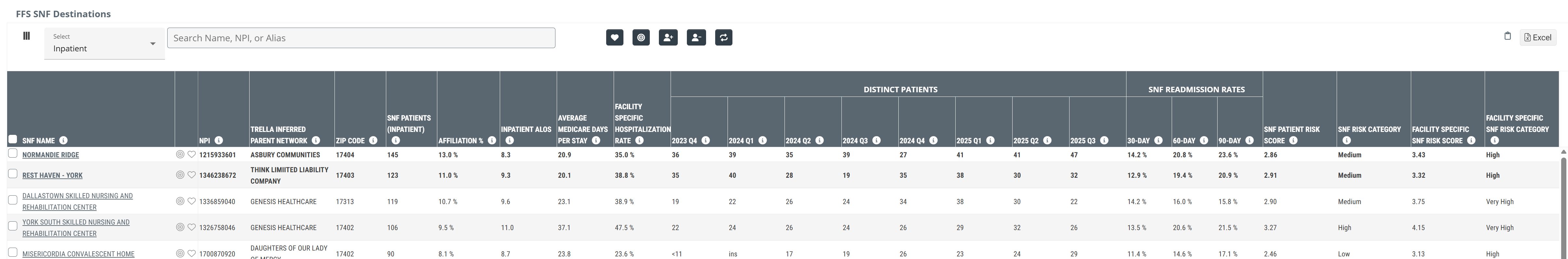
![]() Click on the above image to expand it.
Click on the above image to expand it.
Claim Type Dropdown
At the top left of the table there is a dropdown that allows you to choose the claim type from which the metrics in the table will be calculated. The options are shown in the image below. The dropdown includes the five TEAM categories. Choosing a TEAM category will limit the entries in the table to patients whose claims indicated alignment with the chosen TEAM category.
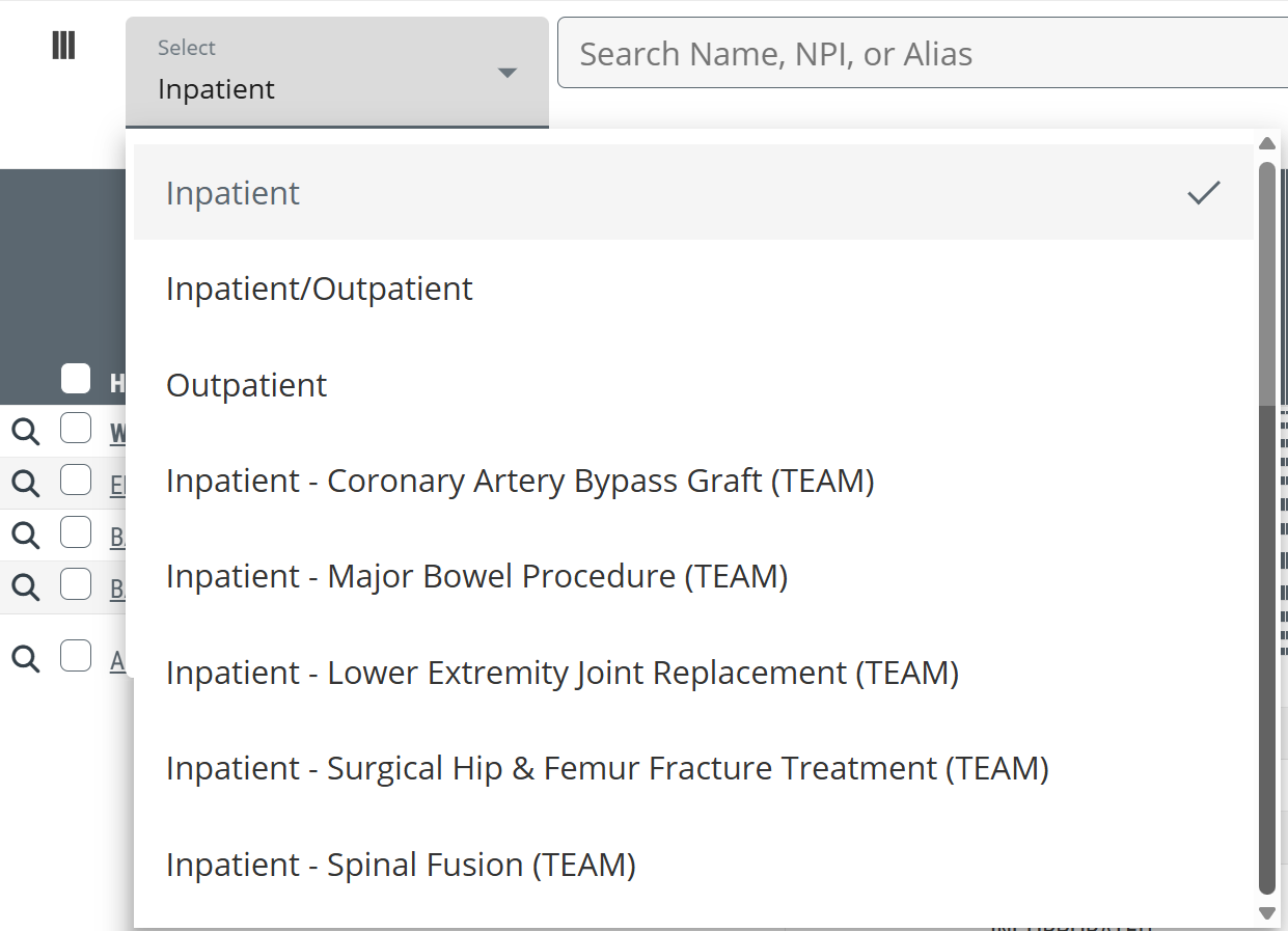
![]() This dropdown allows you to choose which patient type you want to focus on.
This dropdown allows you to choose which patient type you want to focus on.
![]() For more information about the TEAM categories, see TEAM in Trella Insights.
For more information about the TEAM categories, see TEAM in Trella Insights.
|
|
 |
Understanding the Metrics
Metric |
Description |
|
| SNF Name | The official entity name of the skilled nursing facility as listed in CMS Provider Data (NPI) file | |
|
Favorites/Targets
|
Click on these icons to make the listed organization a Favorite (heart icon) or a Target (target icon). | |
| NPI | National Provider Identifier number for the provider. This is maintained by CMS. | |
| Trella Inferred Parent Network | If the listed skilled nursing facility is aligned with a Trella Inferred Parent Network, the network ID is identified in this column. | |
| ZIP Code | This is the ZIP code the facility has listed as their primary location, as pulled from the NPI Registry file. | |
SNF Patients (Inpatient  ) ) |
This metric is the count of distinct patients treated by the selected hospital or agency in the setting indicated (Inpatient, outpatient, etc.) who were admitted to the skilled nursing facility in the row during the one year reporting period.
|
|
| Affiliation % | This metric is the percentage of distinct SNF patients for the selected hospital or agency who were admitted to the skilled nursing facility identified in each row during the one year reporting period. | |
| Inpatient ALOS | The average length of the inpatient stay for patients discharged from the selected hospital or agency who were subsequently admitted to the listed SNF during the one-year reporting period. | |
| Average Medicare Days Per Stay | This count is the average number of Medicare-covered days spent in the listed skilled nursing facility for patients who were discharged from the selected hospital or agency and admitted to the skilled nursing facility within 30 days after discharge during the one-year reporting period. | |
| Facility Specific Hospitalization Rate | Overall two-year hospitalization rate for patients who were discharged from the selected hospital or agency, admitted to the listed skilled nursing facility within 30 days of discharge, and hospitalized during their stay or within 30 days after discharge from a SNF stay. | |
| Distinct Patients | 20YY-Q# | This is the count of distinct patients treated by the selected hospital or agency who were admitted to the skilled nursing facility in each row during the quarter listed in the column header. |
| SNF Readmission Rates | 30, 60, and 90 Day | The percentage of patients discharged from any inpatient setting who were admitted to the listed skilled nursing facility and subsequently readmitted to a hospital within 30 days of the first inpatient discharge (based on a two-year reporting period, shifted back 90 days) |
| Hospitalization Rate: SOC to 30 Days | The overall two-year hospitalization rate for patients who were admitted to the listed SNF and hospitalized within 30 days from start of care at the SNF; includes transfers | |
| SNF Patient Risk Score |
Average Hierarchical Condition Category (HCC) Patient Risk Score for the listed provider
|
|
| SNF Risk Category |
Trella Health has created these categories to make a general comparison between agencies quick and easy.
|
|
| Facility Specific SNF Risk Score |
Average Hierarchical Condition Category (HCC) patient risk score for patients who were discharged from the selected hospital or agency and admitted to the listed SNF within 30 days of discharge.
|
|
| Facility Specific SNF Risk Category |
Categorization of the Facility Specific SNF Risk Score
|
|
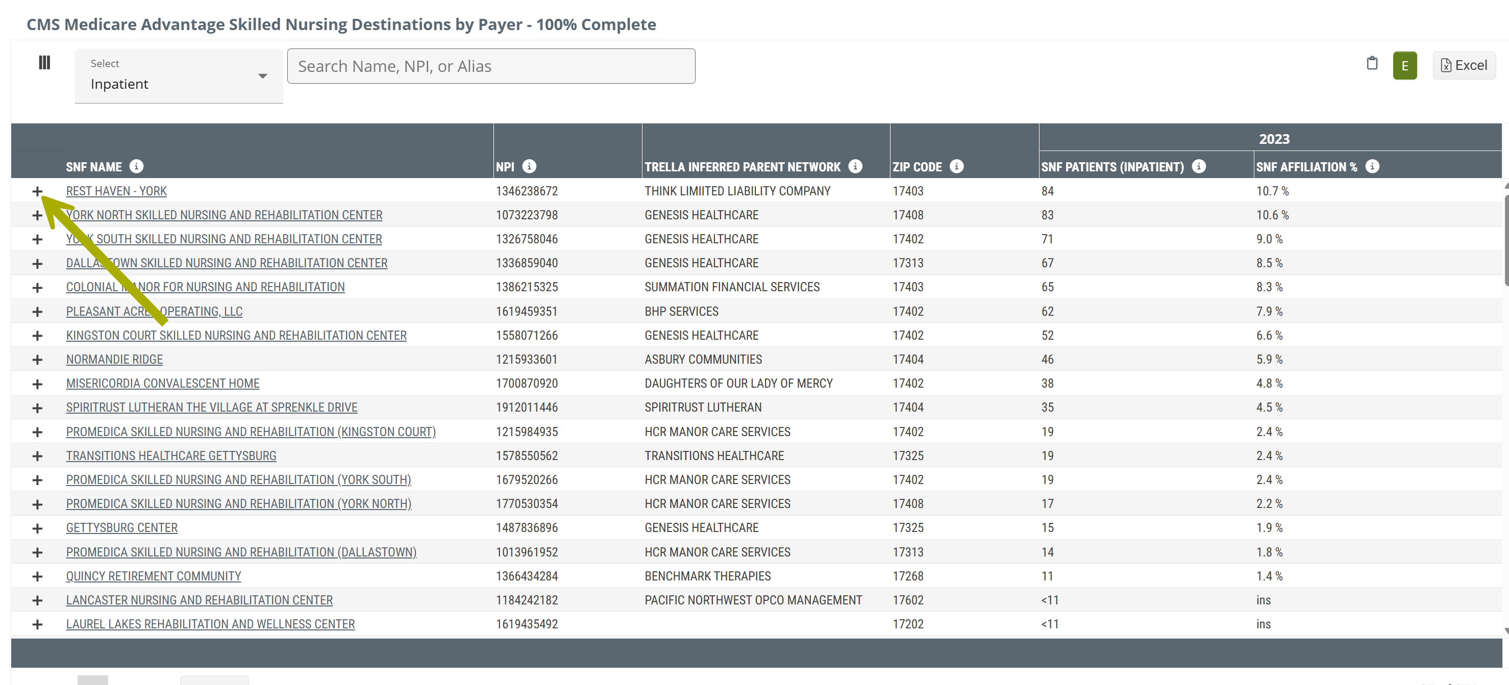
CMS Medicare Advantage Skilled Nursing Destinations by Payer - 100% Complete
This table displays skilled nursing facilities and metrics drawn from the most recent available complete Medicare Advantage claims.
Claim Type Dropdown
At the top left of the table there is a dropdown that allows you to choose the claim type from which the metrics in the table will be calculated. The options are shown in the image below.
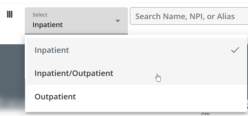
![]() This dropdown allows you to choose which patient type you want to focus on.
This dropdown allows you to choose which patient type you want to focus on.
"By Payer" dropdown
Click on the "+" sign to the left of any listed home health agency's name to open the By Payer panel. (Arrow in image above)
This panel shows the MA payers for patients admitted to the listed skilled nursing facility.
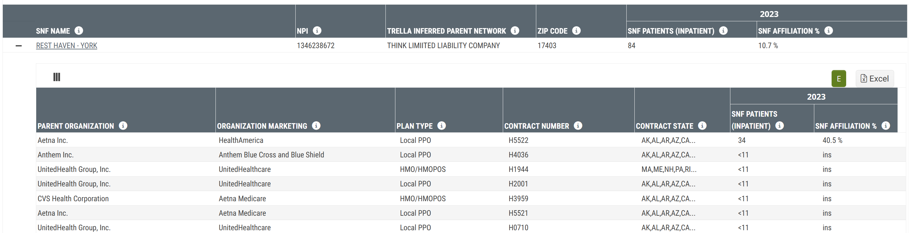
Metric Name |
Description |
|
| Main Table | ||
| SNF Name/NPI | The name and NPI of the skilled nursing facility for which the metrics in the same row are displayed. | |
| Trella Inferred Parent Network | If the listed skilled nursing facility is aligned with a Trella Inferred Parent Network, the network ID is identified in this column. | |
| ZIP Code | The ZIP code for the listed skilled nursing facility; from the NPI Registry. | |
| 20YY |
SNF Patients (Inpatient ) |
This metric is the count of distinct Medicare Advantage patients discharged from the selected hospital or agency in the setting indicated (Inpatient, outpatient, etc.) who were admitted to the skilled nursing facility in the row during the most recent year of available CMS Medicare Advantage data.
|
| SNF Affiliation % | Percentage of distinct Medicare Advantage patients discharged from the selected hospital or agency who were admitted to the listed skilled nursing facility within 30 days after discharge and during 20YY. | |
| By Payer dropdown | ||
| Parent Organization | Name of the parent organization for the listed contract | |
| Organization Marketing | Name that the organization uses to market to beneficiaries for the listed contract | |
| Plan Type | Type of plan offered to beneficiaries within the listed contract | |
| Contract Number | The number listed on the Medicare Advantage Claim | |
| Contract State | The state(s) associated with the listed contract | |
| 20YY |
SNF Patients (Inpatient ) |
The count of distinct Medicare Advantage patients with the listed contract discharged from the selected hospital or agency who were admitted to the listed skilled nursing facility within 30 days after discharge during 20YY - (the most recent year of complete MA data available) where the payer in the row was listed as the primary payer on the claim.
|
| SNF Affiliation % | The percentage of distinct Medicare Advantage patients with the listed contract discharged from the selected hospital or agency who were admitted to the listed skilled nursing facility within 30 days after discharge during 20YY - (the most recent year of complete MA data available) where the payer in the row was listed as the primary payer on the claim. | |
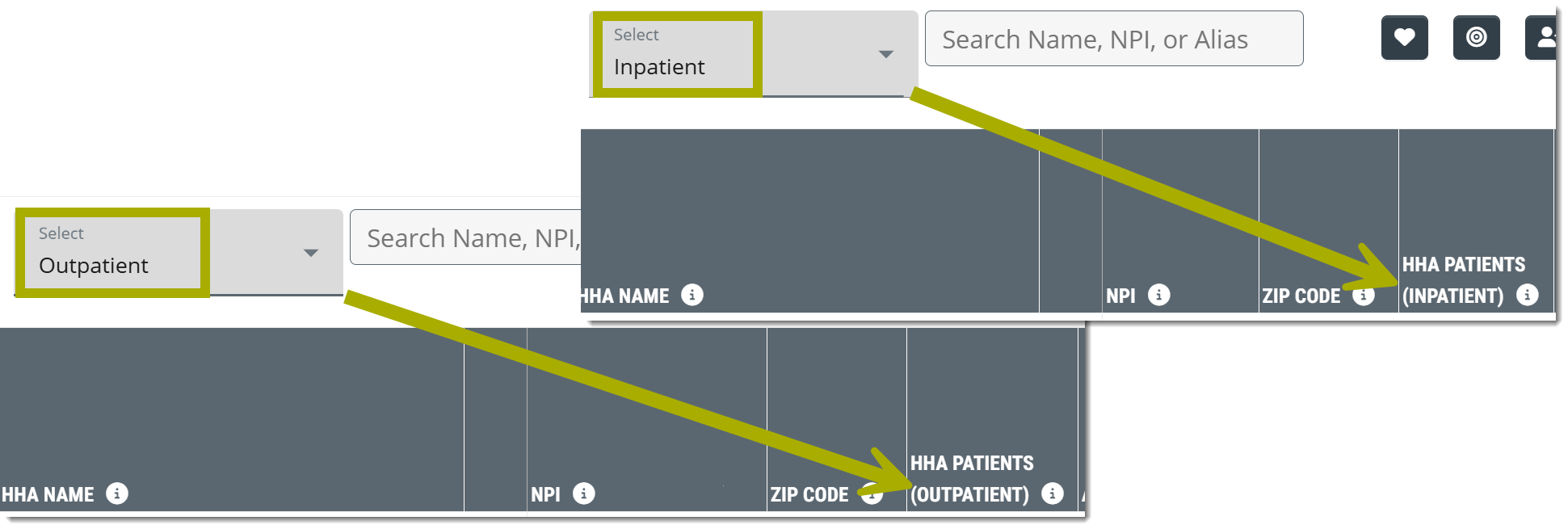
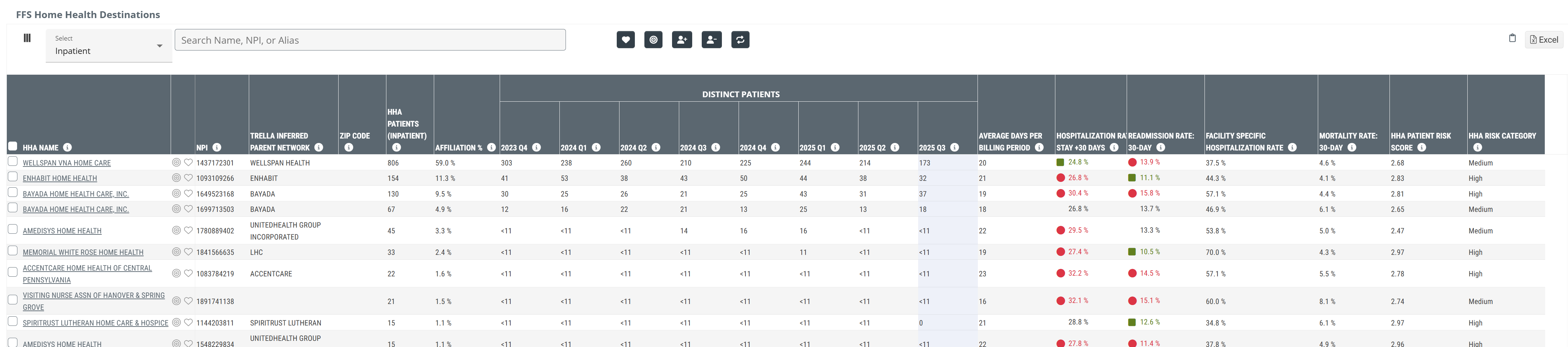
FFS Home Health Destinations table
As the table title identifies, this table displays home health agencies that admitted Medicare FFS patients discharged from the selected hospital or agency . The metrics in the table will allow you to get a sense of the flow of patients from the selected hospital or agency to the listed home health agencies. In addition, you can identify the top home health destinations, or evaluate the patients admitted to your agency during the reporting period.
![]() Click on the above image to expand it.
Click on the above image to expand it.
Claim Type Dropdown
At the top left of the table there is a dropdown that allows you to choose the claim type from which the metrics in the table will be calculated. The options are shown in the image below.
![]() This dropdown allows you to choose which patient type you want to focus on.
This dropdown allows you to choose which patient type you want to focus on.
|
|
|
Understanding the Metrics
| Metric | Description |
| HHA Name | The official entity name of the Home Health Agency as listed in CMS Provider Data (NPI) file |
|
Favorites/Targets
|
Click on these icons to make the listed organization a Favorite (heart icon) or a Target (target icon). |
| NPI | National Provider Identifier number for the provider. This is maintained by CMS. |
| Trella Inferred Parent Network | If the listed home health agency is aligned with a Trella Inferred Parent Network, the network ID is identified in this column. |
| ZIP Code | This is the ZIP code the facility has listed as their primary location, as pulled from the NPI Registry file. |
|
HHA Patients (Inpatient ) |
This metric is the count of distinct Medicare FFS patients discharged from the selected hospital or agency in the setting indicated (Inpatient, outpatient, etc.) who were admitted to the home health agency in the row during the one year reporting period.
|
| Affiliation % | This metric is the percentage of distinct home health patients discharged from the selected hospital or agency who were admitted to the home health agency identified in each row during the one year reporting period. |
|
Patient Admits - Year-Q# |
This is the count of distinct patients treated by the selected hospital or agency who were admitted to the home health agency in each row during the quarter listed in the column header.
|
| Average Days Per Billing Period | This is the average length of home health episodes for patients discharged from the selected hospital or agency and admitted to the named home health agency. The length is calculated from admission to discharge for patients discharged during the one year reporting period. |
| Hospitalization Rate: Stay +30 Days | |
| Readmission Rate: 30-Day | Percentage of patients discharged from any inpatient setting who were newly admitted to the listed HHA and subsequently readmitted to a hospital within 30 days of the first inpatient discharge; includes transfers (based on a two-year reporting period, shifted back 30 days) |
| Facility Specific Hospitalization Rate | The rate at which patients admitted ONLY FROM THE SELECTED HOSPITAL OR AGENCY by the named Home Health agency were admitted to a short-term acute stay during or 30 days after discharge from their Home Health episode. |
| Mortality Rate: 30 Day | The percentage of patients discharged from the listed home health agency who died within 30 days after discharge (based on a two-year reporting period, shifted back 30 days) |
| HHA Patient Risk Score |
Average Hierarchical Condition Category (HCC) Patient Risk Score for the listed home health agency
|
| HHA Risk Category |
Trella Health has created these categories to make a general comparison between agencies quick and easy.
|
CMS Medicare Advantage Home Health Destinations by Payer - 100% Complete table
This table shows home health agencies and metrics drawn from the most recent available complete Medicare Advantage claims.
|
The latest year of data available for Medicare Advantage metrics (complete) is shown at the top right of every page in Trella Insights. (see image) The CMS Medicare Advantage (CMS MA) time period applies to the CMS Medicare Advantage Home Health Destinations by Payer - 100% Complete table. Complete MA claims data from CMS lags behind by two years. |
 |
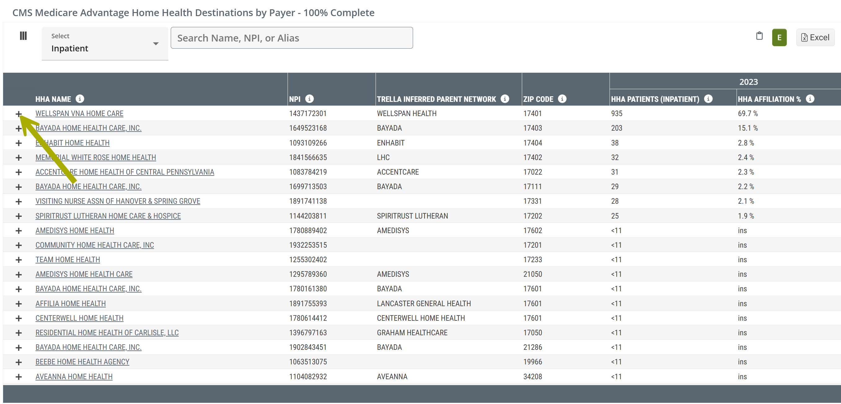
Claim Type Dropdown
At the top left of the table there is a dropdown that allows you to choose the claim type from which the metrics in the table will be calculated. The options are shown in the image below.
![]() This dropdown allows you to choose which patient type you want to focus on.
This dropdown allows you to choose which patient type you want to focus on.
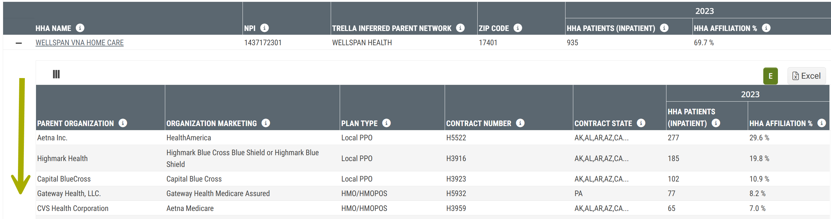
"By Payer" dropdown
Click on the "+" sign to the left of any listed home health agency's name to open the By Payer panel. (Arrow in image above)
This panel shows the MA payers for patients admitted to the listed home health agency.
Understanding the Metrics
Metric Name |
Description |
|
| Main Table | ||
| HHA Name/NPI | The name of the home health agency and the NPI as listed in the NPI registry. | |
| Trella Inferred Patient Network | If the listed home health agency is aligned with a Trella Inferred Parent Network, the network ID is identified in this column. | |
| ZIP Code | The ZIP code for the listed home health agency; from the NPI Registry | |
| 20YY |
HHA Patients (Inpatient ) |
The count of distinct Medicare Advantage patients discharged from the selected hospital or agency who were admitted to the listed home health agency within 30 days after discharge during 20YY - the most recent year of complete MA data available.
|
| HHA Affiliation % | The percentage of distinct Medicare Advantage patients discharged from the selected hospital or agency who were admitted to the listed home health agency within 30 days after discharge during 20YY - the most recent year of complete MA data available. | |
| By Payer dropdown | ||
| Parent Organization | Name of the parent organization for the listed contract | |
| Organization Marketing | Name that the organization uses to market to beneficiaries for the listed contract | |
| Plan Type | Type of plan offered to beneficiaries within the listed contract | |
| Contract Number | The number listed on the Medicare Advantage Claim | |
| Contract State | The state(s) associated with the listed contract | |
| 20YY |
HHA Patients (Inpatient ) |
The count of distinct Medicare Advantage patients with the listed contract discharged from the selected hospital or agency who were admitted to the listed home health agency within 30 days after discharge during 20YY - (the most recent year of complete MA data available) where the payer in the row was listed as the primary payer on the claim.
|
| HHA Affiliation % | The percentage of distinct Medicare Advantage patients with the listed contract discharged from the selected hospital or agency who were admitted to the listed home health agency within 30 days after discharge during 20YY - (the most recent year of complete MA data available) where the payer in the row was listed as the primary payer on the claim. | |