Overview
This table is the flip side of the table Discharge Events by Setting . That table answers the question, "After Discharge, where'd everybody go?" This table answers the question, "What happened when they got there."
This action-packed table provides several insights into the post-acute care provided to patients discharged from the selected facility. Readmit rates and mortality rates are calculated for several different post-acute destinations with county and state averages available as benchmarks for comparison.
The Outcomes by Setting table will only have an Inpatient version for selected hospitals and a SNF version for selected skilled nursing facilities. The image below is for a hospital. For a selected SNF, the table will be identified by "SNF," instead of "Inpatient," or "INP."
 In this article
Metric Summaries
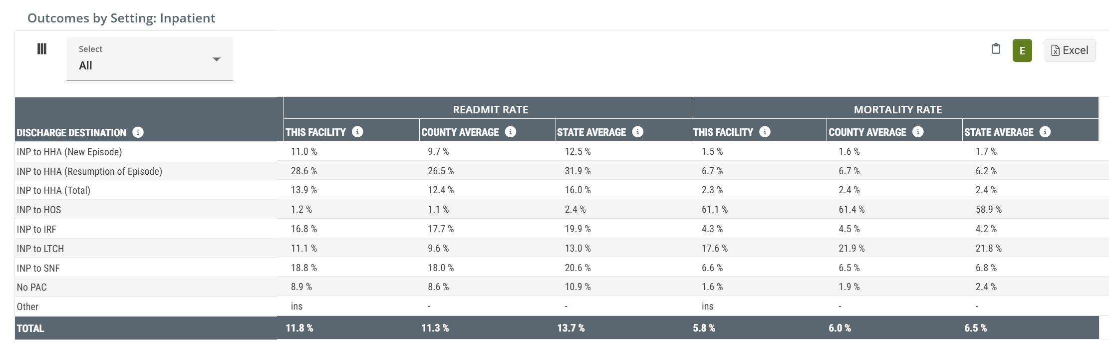
- Discharge Destination - Think of this as patient pathway since there is a source and destination listed. In this column we identify which post-acute destination the inpatient discharges were admitted to. Example: INP to HHA indicates that the metrics in this row pertain to patients who were discharged from INP and were admitted to HHA
-
Readmit Rate - This is the percentage of discharges from the selected facility and admitted to the type of post-acute care listed that were readmitted to a hospital within 30 days of the initial discharge. Another way of looking at this is that this is the readmit rate for the selected facility calculated from the subset of patients who entered the listed post-acute care setting.
- State and County benchmarks are included for comparison
![]() For more information on Readmission rates, see Readmission Rates.
For more information on Readmission rates, see Readmission Rates.
- Mortality Rate - This is the rate at which patients expired within 30 days of discharge from the selected facility following admission to the type of post-acute care identified in the row.
![]() For more information on the category, "other," see Facilities Analyze page - What is "Other?"
For more information on the category, "other," see Facilities Analyze page - What is "Other?"
Each row contains metrics related to patients from the selected facility to the type of post acute care listed in the first column/row header. In general, there are three perspectives on the content in this table:
- Each row reveals information related to a specific post-acute setting. This provides relevant insights into post acute outcomes in the connection between the selected facility and a specific type of post-acute care.
- Each column allows you to compare the types of post-acute care. This will give you a general understanding of post-acute care, but needs to be only used as a general guideline. From this image above, we can see that, in general, Home Health Readmit rates are substantially higher than Hospice readmit rates. At the same time, Hospice mortality rates are higher. Both of these observations confirm what we would expect about the differences between the two post-acute settings.
- County and state averages for the same metrics allow you to evaluate the performance of the selected facility against its peers.
Readmit Rate
A readmission is a multi claim event where a patient is discharged from an inpatient stay at a short term acute care hospital and is readmitted to inpatient care again within 30 days. This readmission scenario could include a post-acute stay, or multiple post-acute stays during that 30 day period. The goal of a readmit rate is to evaluate each facility's success at keeping patients out of the hospital.
For a hospital, this rate reflects all inpatient discharges that are readmitted within 30 days.
For any other post-acute facility, (primarily SNFs on this page), the rate is the percentage of all admissions who are readmitted to inpatient care within 30 days of a prior inpatient discharge. If the post-acute admission did not follow an inpatient discharge, there is no possibility of a readmission.
For more information about Readmit Rates, see Readmit Rates and Hospitalization.
The following equation is a summary of how we calculate this metric. The percentage is calculated using a 2 year reporting period.
Mortality rate
The rate at which patients expired within 30 days of discharge from the selected facility for patients admitted to the post-acute care type listed.
The following equation is a summary of how we calculate this metric.
For more on Mortalities, see Critical Concepts - Mortalities.
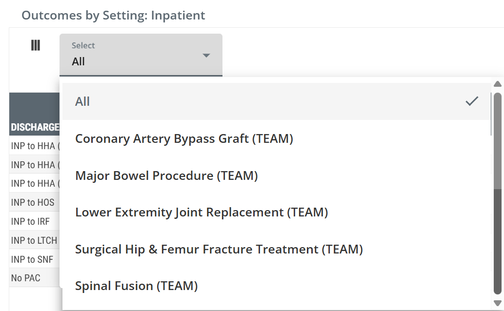
TEAM Insights
|
The dropdown at the top left of the table allows you to choose one of the five TEAM Episode categories. Selecting a specific category will limit the metrics in the Outcomes by Setting: Inpatient table to discharges from the selected hospital that align with the chosen episode category. Click on a single option from the dropdown list. |
 |
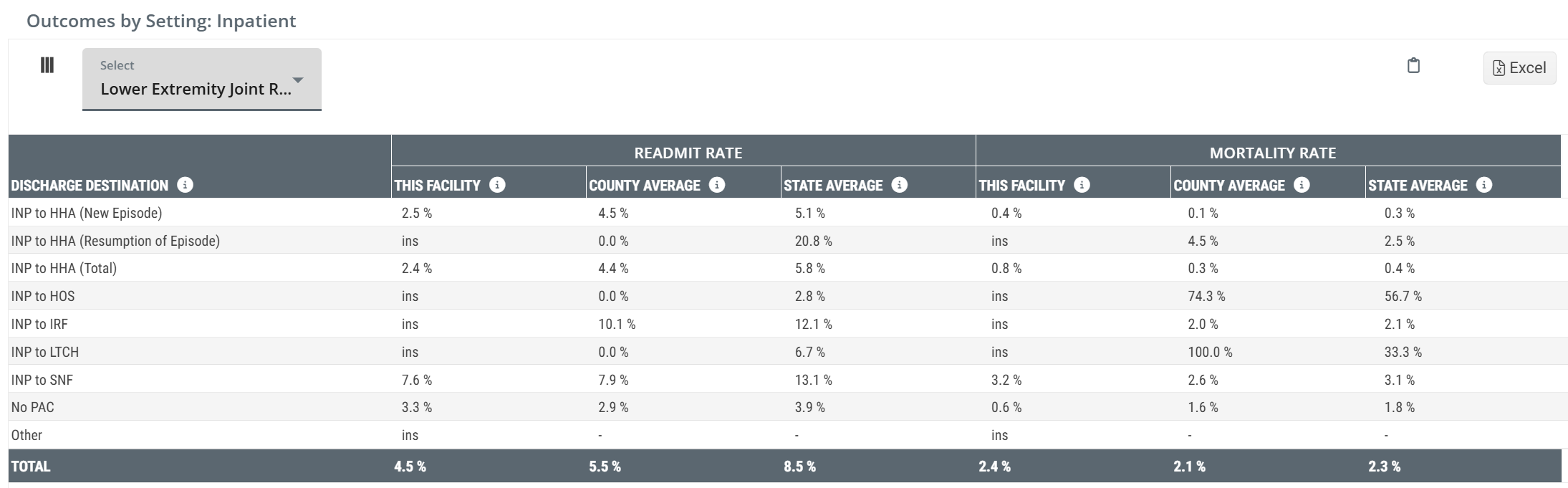
The following image shows an example of the Outcomes by Setting: Inpatient table with a specific TEAM Episode category selected - Lower Extremity Joint Replacement.
 Details
-
Discharge Count - Applying a TEAM category and a filter will shrink the number of discharges counted for each patient path in the table.
- As a result, it is likely that there will be more <11 counts shown in the table. This will also result in more "ins" Adherence Rates since there is insufficient data to calculate a rate.
- Value! - The same valuable insights about post-discharge outcomes are shown in the table, but the filter adds a narrowed focus on one TEAM category. In light of the anticipated outcomes of this initiative, being able to strategize with hospital partners focused on TEAM related discharges will strengthen your collaboration.
- More Value! - Sometimes the insights we gain from metrics in Trella Insights are subtle and sometimes they shout.
![]() If we compare the readmission rates for inpatient to home health (2.4%) to those for inpatient to skilled nursing (7.6%) for patients aligned with the chosen TEAM category, Lower Extremity Joint Replacement, there is a 5.2% advantage by getting those patients into home health care! Since we know that this represents a patient population of 230 patients (from the Discharge Events by Setting table) some quick math leads to the following:
If we compare the readmission rates for inpatient to home health (2.4%) to those for inpatient to skilled nursing (7.6%) for patients aligned with the chosen TEAM category, Lower Extremity Joint Replacement, there is a 5.2% advantage by getting those patients into home health care! Since we know that this represents a patient population of 230 patients (from the Discharge Events by Setting table) some quick math leads to the following:
![]() 230 patients X 5.2% = 12 patients who could have been potentially kept from a costly readmission.
230 patients X 5.2% = 12 patients who could have been potentially kept from a costly readmission.
![]() Of course, an individual patient's journey through the healthcare continuum isn't always as simple as a choice between two destinations. Nevertheless, the indicated potential is compelling.
Of course, an individual patient's journey through the healthcare continuum isn't always as simple as a choice between two destinations. Nevertheless, the indicated potential is compelling.